
Mastering the Art of Coordinating Fabric and Jewellery Colours for a Stunning Look
28 Sep 2026
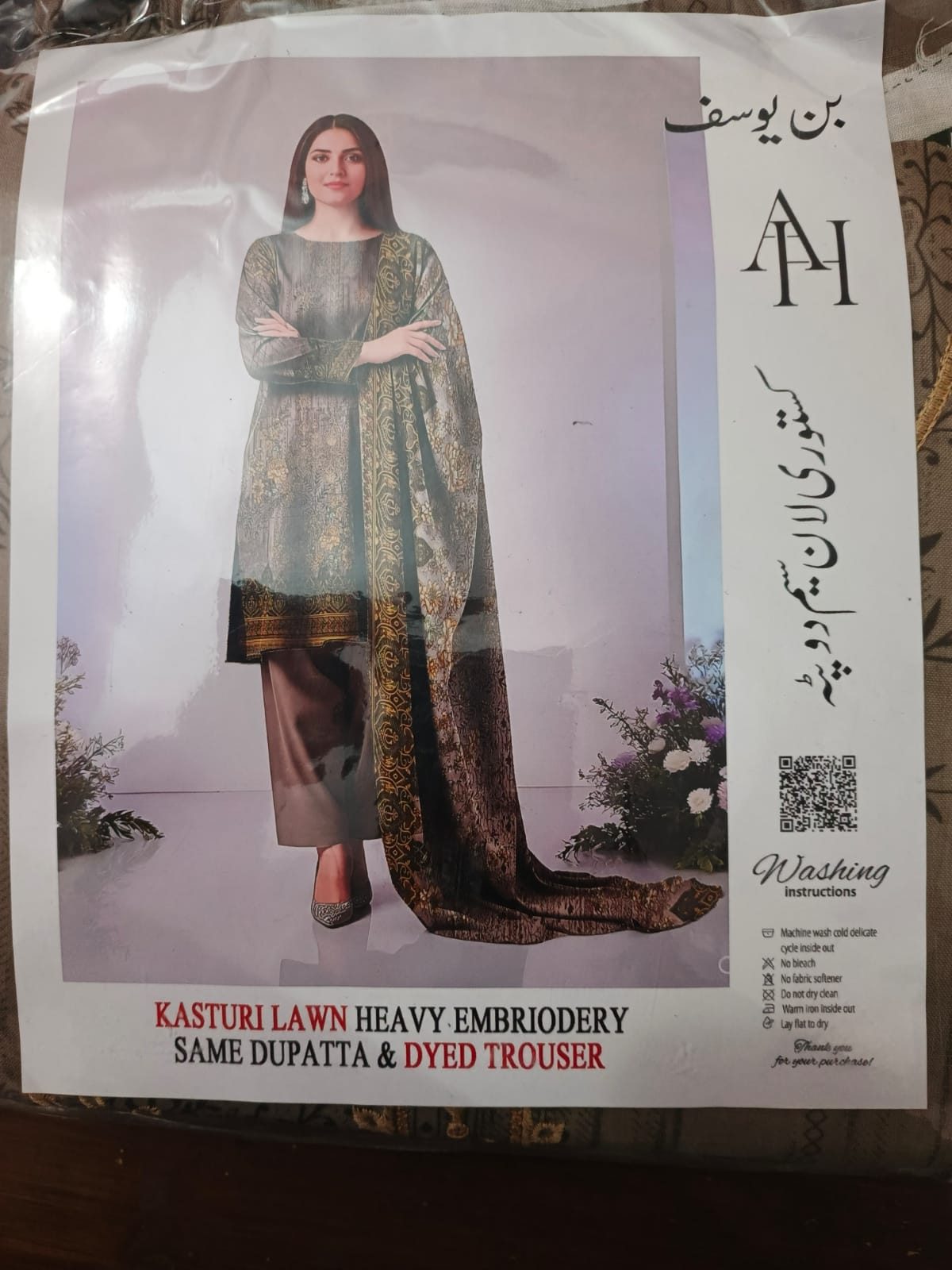
Discover practical tips on how to seamlessly coordinate fabric and jewellery colours to elevate your style. This guide helps Tokrri shoppers make informed choices that enhance their overall appearance.
Understanding the Basics of Colour Coordination
Colour coordination is about creating harmony between your outfit and accessories. When shopping for fabrics and jewellery at Tokrri, it's essential to understand the colour wheel and how colours interact. Complementary colours (opposites on the wheel) can create vibrant contrasts, while analogous colours (next to each other on the wheel) offer a more subtle, cohesive look. Keeping this in mind helps you choose jewellery that either accentuates or balances your chosen fabric colours.
Matching Jewellery with Fabric Tones
Consider the tone of your fabric first—whether it is warm, cool, or neutral. Warm tones like reds, oranges, and yellows pair beautifully with gold or copper jewellery that enhances their richness. Cool tones such as blues, greens, and purples work well with silver, platinum, or white gold, which complement their crisp appearance. Neutral fabrics like beige, black, or white provide flexibility, allowing you to experiment with both warm and cool jewellery shades.
Choosing Jewellery to Enhance Printed and Embroidered Fabrics
Printed and embroidered fabrics often feature multiple colours, so selecting jewellery requires a careful approach. Identify the dominant or accent colours in the fabric and opt for jewellery that picks up these hues to create a cohesive look. When fabrics have intricate embroidery, simpler jewellery designs can prevent the outfit from looking too busy. Conversely, subtle prints can be paired with more statement jewellery pieces to add interest.
Balancing Bold Fabrics with Subtle Jewellery
If your fabric has bold colours or patterns, it’s wise to balance the look with understated jewellery. Solid, single-colour pieces in metallic tones or with minimal embellishments work well to keep the focus on the fabric while adding a touch of elegance. Tokrri shoppers can explore delicate chains, small studs, or simple bangles that complement without overwhelming.
Experimenting with Colour Pop and Contrast
For those who enjoy a more adventurous style, contrasting jewellery colours can create striking visual effects. For example, pairing a green outfit with ruby red jewellery or a blue fabric with amber accessories can add a refreshing pop. The key is to maintain balance by ensuring that the colours do not clash harshly but rather complement each other’s vibrancy.
Practical Tips for Shopping at Tokrri
When shopping for fabrics and jewellery at Tokrri, consider bringing fabric swatches or photos of your outfit when selecting accessories. This helps in matching colours accurately. Also, try different combinations in natural light to see how colours interact in various settings. Taking your time to coordinate colours thoughtfully will result in a polished and stylish ensemble that reflects your personal taste.